
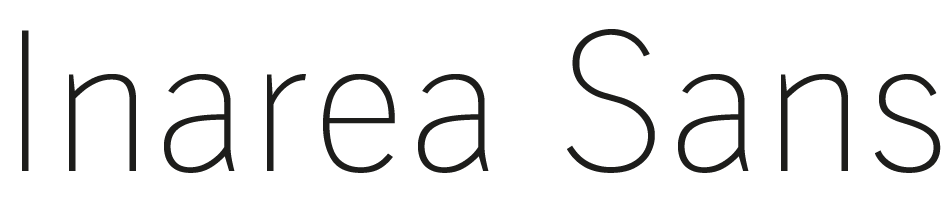
Inarea Sans
about the project
Year: 2022-2023
Client: Inarea
Cathegories: Type Design
During my time at Inarea, I undertook the revitalization of their outdated proprietary typeface, which was originally designed by Antonio Pace.
The typeface had a limited family, lacked essential open type features and had problems with the definition of some glyphs outlines.
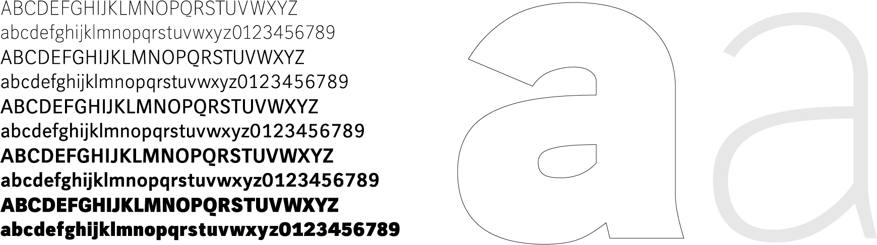
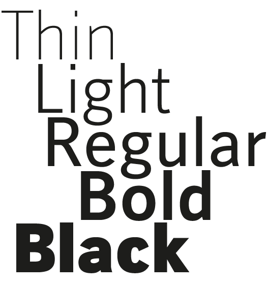
The main change consists in the expansion of the family with the addition of two new weights (Thin and Black) and the development of a Variable Font to offer a more versatile and complete typographic solution.
I also fixed all the outlines issues in the existing weights to make sure there were no more technical issues in the definition of the shapes.
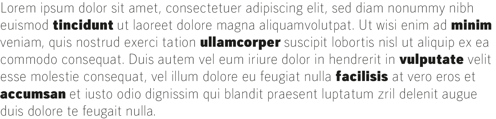
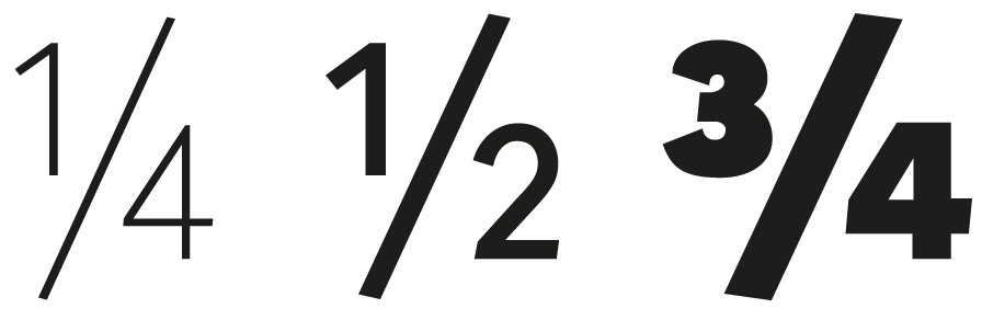
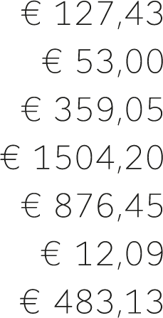
To improve functionality and aesthetics, I’ve expanded the character set to include glyphs for case-sensitive punctuation, several number variations (case-sensitive, tabular, superior and inferior), and fractions.
These new features make the font more complete and suitable for a wider range of applications.