
Conservatorio di Milano
About the project
Year: 2023
Client: Inarea
Categories: Type Design, Brand Identity
Inaugurated on 3 September 1808, the Milan Conservatory has since then been one of the most prestigious institutions for the study of music, at a national and international level.

concept
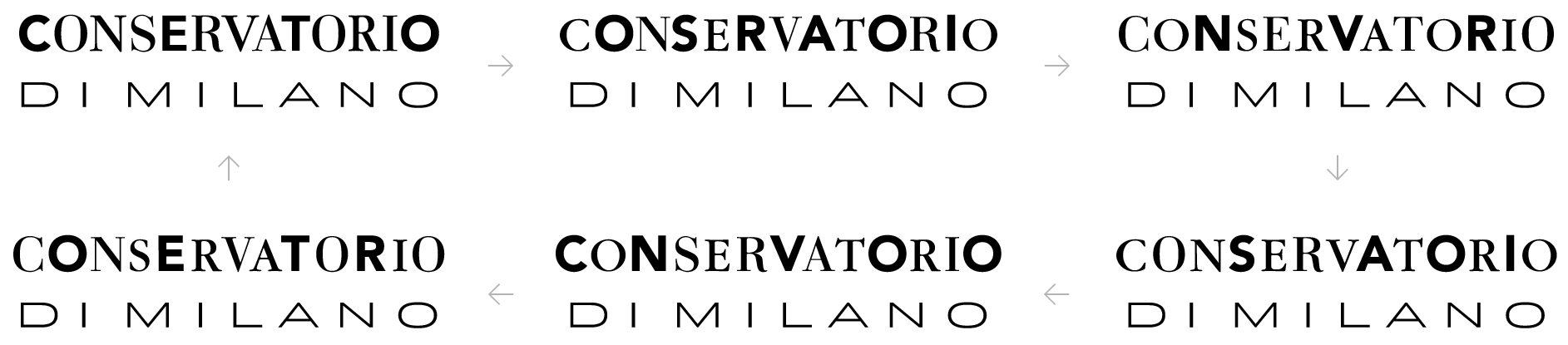
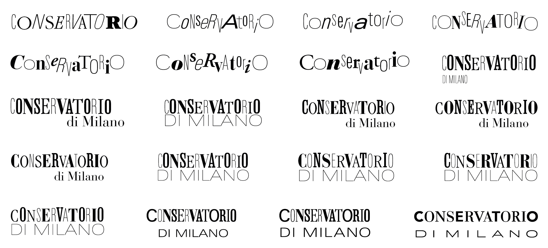
Creation of a dynamic and versatile logo that captures the multifaceted essence of the academy, showcasing the various styles and disciplines taught at the prestigious Milan Conservatory, established way back in 1807.
The logotype is designed to evolve, symbolizing the dynamism of the academy, and come to life through its interaction with music.
Project created for Inarea, under the creative direction of Antonio Pace.
Before

After


variable font
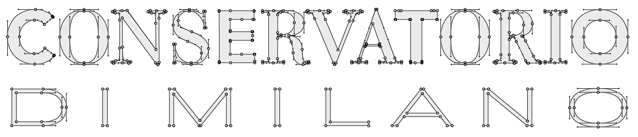
The main challenge of this project was the design of a variable font that smoothly interpolated all the different typographic styles present in the logotype.
To make this work it was necessary to pay a lot of attention during the drawing, both in the number and positioning of the individual nodes that describe each glyph.